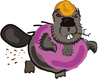
Straight up it was tough because I had never used Illustrator before, and never drawn a beaver. I also don't have a tablet which would make it much more difficult. However, first off I drew up two rough ideas of the logo on paper before roughing it out in Illustrator. A while later (aka a very very long time of fiddling and erasing) this is what I came up with:

I kept it cartoony and with relatively few colours/lines, don't ask about the pink singlet, it was just what I was asked to do. :P
So I sent that back to my friend who subsequently sent it on to her client. I then received word back that I needed to simplify the picture a LOT. Its funny now because I had drawn the above picture when trying to be relatively simple. (Normally in my drawings I do a lot of shading)
The other point was I had to make everything solid; solid defining lines that flowed. Takign this into consideration I came up with this design:
 Once again I sent this design onto my friend. However I got feedback saying the client wanted it to be even more simple, and more angular. I really had no wish to redraw a whole new beaver in Illustrator so I sketched out a bunch of different beavers on some paper:
 I showed this to my friend, but she said she wanted even more simple. So I sketched up a few more:
 Thsi was getting closer, but before I could show this to my friend she emailed asking me to do its in extreme simplicity. She gave me a couple of examples of what her client was looking for. (Which were much simpler then the above sketch; pure simplicity)
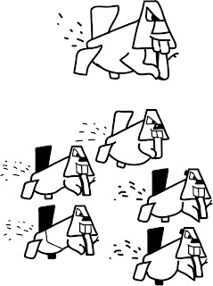
So I started again in Illustrator, coming up with these drawings:
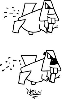
 With this, we were almost there. My friend just gave me a couple more suggestions and finally I ended up with the bottom picture in the one below:
So I'm yet to hear from my friend's client, but I'm fairly confident that this is very close to the finished product. It was very tiring doing this, my first logo in a program I had never used before. A definite challenge but I reckoned I learned a huge amount.
This product also might have its own website, so its quite exciting if they end up running with my design. :P
0 Comments:
Post a Comment