Showing posts with label Creative stuff. Show all posts

Playing with explosions

2 Comments
.

This morning I spent some time messing around with various lighting and explosion effects in Cinema 4D. This hardest part about this sort of stuff is getting the lighting right, so that it looks like th explosion is naturally lighting up the text by itself. The explosion in both these pictures are the same, except the blogging one has a little more small debri. I prefer the "Splode" one better, but I spent a fair bit more time on it. The blogging one was a quicker throw-together. Which one do you like better?

Starcraft 2 design

1 Comments
Just a little summat I knocked up.

I've been watching a ton of SC2 replays on youtube, which I only got into over the past couple of weeks. (Quickly resulting in breaking the download cap :S) Even though I've never played the original I've been sucked in and am thinking of getting one version of Starcraft or another, despite how much I despise Blizzard. :P

Messing with 3D text

0 Comments
I'm in love with Cinema 4D. Its porbably my favorite program of all time. Not only is it really powerful, but its unbelievably simple to understand and learn. I've only got the trial version for 22 more days, but am having a blast. The picture below is from following a tutorial, with a bit of my own experimentation on it. Unfortunately the trial version is stuck with a lower resolution.

I'm in love...


MMO post tomorrow!

Development of my first logo

0 Comments
So after finishing school last year I have been trying to get some work experience doing some graphic design. A week or more ago a journalist/graphic designer/photographist friend contacted me asking me to create (Amoung other things) a logo for a new piece of farming machinary. I was told that the machinary would be called "Bionic Beaver" so I would have to use Adobe Illustrator to draw up a beaver facing to the right, with evil eyes and woodchips shooting out its bottom.

Straight up it was tough because I had never used Illustrator before, and never drawn a beaver. I also don't have a tablet which would make it much more difficult. However, first off I drew up two rough ideas of the logo on paper before roughing it out in Illustrator. A while later (aka a very very long time of fiddling and erasing) this is what I came up with:
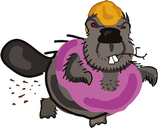

I kept it cartoony and with relatively few colours/lines, don't ask about the pink singlet, it was just what I was asked to do. :P
So I sent that back to my friend who subsequently sent it on to her client. I then received word back that I needed to simplify the picture a LOT. Its funny now because I had drawn the above picture when trying to be relatively simple. (Normally in my drawings I do a lot of shading)
The other point was I had to make everything solid; solid defining lines that flowed. Takign this into consideration I came up with this design:

Once again I sent this design onto my friend. However I got feedback saying the client wanted it to be even more simple, and more angular. I really had no wish to redraw a whole new beaver in Illustrator so I sketched out a bunch of different beavers on some paper:

I showed this to my friend, but she said she wanted even more simple. So I sketched up a few more:

Thsi was getting closer, but before I could show this to my friend she emailed asking me to do its in extreme simplicity. She gave me a couple of examples of what her client was looking for. (Which were much simpler then the above sketch; pure simplicity)

So I started again in Illustrator, coming up with these drawings:
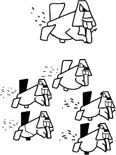
With this, we were almost there. My friend just gave me a couple more suggestions and finally I ended up with the bottom picture in the one below:
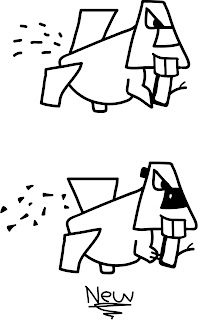

So I'm yet to hear from my friend's client, but I'm fairly confident that this is very close to the finished product. It was very tiring doing this, my first logo in a program I had never used before. A definite challenge but I reckoned I learned a huge amount.

This product also might have its own website, so its quite exciting if they end up running with my design. :P

Photshop, at long last

1 Comments
Its been quite a while since I have posted up anything that I've done creatively. This is something I have to knock up very quickly for my uni interview + portfolio the next day. I started off following a standard tutroial, but quickly went off track and started mucking around.

Photoshopping: New Signature

1 Comments
Haven't posted a photoshop job for a while now, so here we are. Knocked this up fairly quickly to use as my signature for the Allods Online forums.

Original:

Signature:
0 Comments
Instead of my (un)usual Photoshop job every weekend, I spent a lot of time making my Youtube page look a little bit better. At first I was having a lot of problems getting the scale right, but after downloading a free template the rest was pretty straightforward.

One poor sonnet would kill it stone dead

0 Comments
That's the kind of thing you put in when you are thinking of a post title and a movie is playing in the background.
This post is going to be a random splurge, as I know how popular that is on the interwebs, but its my blog and I'm trying to avoid studying.

First things first: I have 4 weeks of school left! Surprisingly I'm not getting a huge amount of work, probably as all our teachers expect us to be studying/revising like crazy, which I'm not doing too much of. During the weeks leading up to my exams though I have committed to removing my computer and preventing myself from even checking my emails. As it is, I waste an insane amount of time on the computer and to get any work done I'm going to have to throw it out for a few weeks. If I get a TER of 80+ (In the top 20% of the year 12s) then I'll be able to get into most graphic design courses around, but my predicted TER mark for the first semester was at 77.5. This is extremely low compared to most people around me as some consider it a disgrace to get below 90. However, my marks for all my subjects have improved and hopefully, with a bit more effort I'll be able to get my desired TER. However, some time in the future the blog and my Youtube page will go quiet for a couple of weeks.


Boring stuff out of the way...I have been playing a fair amount of CoS over the past couple of days. The game kind of reminds me of the mood of LotRO, where sometimes I felt like just wandering around and exploring, content to put leveling aside for some time. As I discover more of the world I'm becoming more interested as the game is both extremely beautiful and wonderfully detailed. It would be nice if there were a few more NPCs in the cities to give it a bit of life as it can be strange walking into a city square and there is only a dozen people standing around in the middle of the day. I'm loving the quests more and more as a couple of times now I have been given a quest which requires me to solve a riddle which actually requires me to read the quest text and think about what to do. However, like I said in my previous post, this area has likely been polished like crazy to reel in potential subscribers. We'll see how it develops.

Lastly the game is now 100% free to play with no cash shop whatsoever, so it will be interesting to see how long it takes for one to be implemented. I heard somewhere that a new company was taking over the game so who knows...perhaps everything is going to change??

Lastly lastly, I have fiddled a bit more on my Youtube picture and hopefully it looks a bit better.

Till we meet again, my friends.

Freetoplaynoob signiture pic

0 Comments
Well this took me most of my afternoon, just messing around and trying out various things. I plan to use this at the start of every youtube video so it would be great if I could get some feedback on it. Sigh. Now I have to go and spent a couple of hours on modern and ancient history

I had fun with this one

0 Comments
Its amazing how creative you can get when you have a trek of an English essay to write. Bonus points to the person who can tell who the guy is.

Matrix makeover

0 Comments
As with most of my Photoshop jobs, I kind of start with an idea then experiment and sit back and enjoy it as the project evolves. Originally I had no intention of it being Matrixy, but that's what developed. Before
After
After a bit more editing

Photoshopping...how I missed you

1 Comments
I had a pretty fun time coming up with this design. Made my own custom brush, put on some radial blur, adjusted colour, added a random texture, added some text, customized text, and was done! It might remind you of Activision, but I didn't realize at the time. :P

I'm late...Photoshop Saturday (#Let's not do numbers anymore)

1 Comments
Well, looking over previous posts I'm beginning to think maybe I should get someone to proofread them before I click 'create post' because of the amount of grammar or spelling mistakes. :P
Anyway, yesterday was Saturday and I forgot to post my Photoshop exploit so here it is. The question is: would you go?

I was showing off to my brother so I did it really quickly, its not for anything specifically so I leave it up to your imaginations. :P

Photoshop Saturday: Flowery desktop (#4)

0 Comments


Sorry for lack of posts/excess amount of pictures but exams....
Just an experimental background I made myself while bored :P

Photoshop Saturday: Bit Creepy (#3)

0 Comments


Aim was to get a skull which had a skin-like texture. Anyway, just finished studying Ancient History and about to write up a practice essay for English Lit...FUN!

Photoshop Saturday (#2) MonsterTruck

1 Comments


This was just a bit of ridiculous fun.

Photoshop Saturday

0 Comments


So continuing with the idea I had last week, I'll be trying to post something I did on photoshop every week on Saturday.

Rhinoxer

1 Comments


MOAR photoshopping. Main problem with this one was I hadn't picked a great rhino head so it was kind of off balanced on the guy's arm.

Photshopping a signiture

0 Comments
To set myself a challenge, and to do something fun I went out to make my own signature. You know the images that users stick at the bottom of their posts on forums? I thought this would test me in a lot of different ways, and every once in a while I pressed 'print-screen' to show my progress.


First picture, just a basic screenshot I took in WAR.


Positioning all the parts of the shot that I want to use with very basic edges.


After some time of trimming edges I got a more refined view of the picture. The colour still needs work amoung other things.


Adjusted colours of the various layers, now I thought it was too red, and overbearing.

Will continue in next post as it seems that blogger doesn't like more then four images.

RoM Review (Design more-so)

2 Comments
I have decided to share with you guys the two-page review that I did of RoM as part of my design-my-own-mag project. I quickly typed up the review so it needs a lot of editing, but the main thing I wanted to concentrate on was the design of the review. Here is the first version of the review;

I wasn't completely happy with the colour scheme there as I thought there was too much white in the picture, and the text was a little overwhelming. So after a bit of tweaking I got this:

Much happier with this one, but still there is a lot of room for improvement!
 
Copyright © Chappo's Corner Blogger Theme by BloggerThemes & newwpthemes Sponsored by Internet Entrepreneur